Friday 7 January 2011

Rendering in Passes

Did some basic research on what a render pass is, i know it can help me with lighting certain areas of the scene, and not others. At this stage i want to really just learn what the process is, rather than implement it into my work, as i don't feel it is necessary yet.
Eventually i want to introduce it into the project, so that we can light certain corners of the room and certain faces of the building in a different way to others. Also i want to find an alternative way of lighting the projection of the window on to the floor and walls of the inside building. Learning this process now will be a good learning curve.

What is a Render Pass? (from 3drender.com)
Rendering in passes is the process of rendering different attributes of your scene separately, such as the different pass types below.


A beauty pass (sometimes called diffuse pass or color pass) is the main, full-color rendering of your subject, including diffuse illumination, color, and color maps. A beauty pass usually will not include reflections, highlights, and shadows, which are usually separate passes.

Highlight passes (sometimes called specular passes) isolate the specular highlights from your objects. You can render highlight passes by turning off any ambient light and making the object’s diffuse shading and color mapping to pure black. The result will be a rendering of all the specular highlights in the scene, over a black background, without any other types of shading.

A reflection pass includes reflections of other objects or the surrounding environment, and can either replace or complement the highlight pass. To isolate reflections, usually all you need to do is turn off ambient, diffuse, and specular shading from a surface, so that only reflections appear.

A shadow pass is a rendering that shows the locations of shadows in a scene. A shadow pass often appears as a white shadow region against a black background, a black shadow against a white background, or a rendering with the shadow shape embedded in the alpha channel. Cast shadows are where an object casts a shadow onto another 3D object or darkens an area of a live-action plate. Separate shadow passes can depict attached shadows, where an object casts shadows onto itself, such as the shadow a character's nose casts onto his own face.

A lighting pass is an optional part of multi-pass rendering, that adds flexibility and control to the compositing process. Instead of rendering a beauty pass all at once, you could instead render multiple lighting passes, with each individual lighting pass showing the influence of one light (or one group of lights) on an element. Other lights are hidden or deleted when rendering the lighting pass.

Effects passes may sometimes be rendered, depending on the needs of your project. An effects pass is a separate rendering of a visual effect or a mask for a visual effect. An effects pass might be an optical effect, such as a light glow or lens flare, or a particle effect, such as a cloud of smoke or plume of jet exhaust.

A depth map (also called Z-Depth or a depth pass) is a pass that stores depth information at each point in your scene. Some productions use depth maps rendered in a special depth map file format. Other productions use simulated depth maps which are rendered as standard image files just like any other pass, but with a depth-fading effect over objects with constant white shading.

Passes can be rendered one at a time by rendering differently modified versions of your 3D scene, or some software can set them up automatically or render more than one pass type at once.(from 3drender.com)

Tutorial
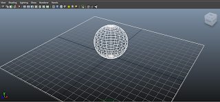
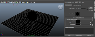
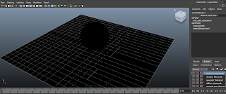
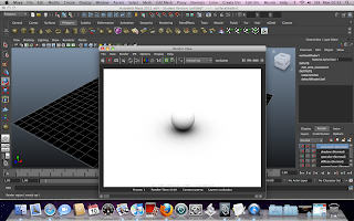
I was watching a tutorial trying to get my head around render passes, however the tutorial was using Maya 2009 and i have 2011, so some things were different, i managed to make some progress as seen from images below, however, i didn't properly understand the process. I know i am going to have to learn this eventually, so i am going to attempt to give it another go at a later stage, as it can take back stage for now.


Thursday 11 November 2010

Tree

Tree rig
I set about making a model of a tree, so that i could rig it and produce a couple of tests. I felt this was important to do as Ive volunteered to help with some secondary animation and i need to give the trees some lifelike features for example gently swaying in the wind or in the breeze. The initial concepts for the trees were to have them as topiary shrubs, so i thought there was no point looking into movement of individual leaves on the tree at this point as it wouldn't be necessary. Instead i looked to give the shape i created a nice flexible feel, so that it could bend naturally like a flimsy tree would under wind pressure.


Below are some screen shots of the very simple rig i made of three joints together, with an IK handle, and then bound to the simple model i made.


Using the rig
A test video of how the rig enables the tree to move


A little mock up of the rig in action


I also did a quick test of the bottle falling and smashing below, however this is not appropriate anymore as the job has been handed on to somebody else.

Leaf

I found a great bit of research in the form of the tutorial below which is bound to help me in huge quantities, when i attempt to animate the leaf fly through in the scene. The tutorial is for 3DS max but will help me with the creative aspect of the process, rather than the technicalities of the program its running off.

Leaf Lag tutorial and tips (3ds max)
http://www.wonderhowto.com/how-to-auto-lag-leaf-animation-secondary-animation-autodesk-3ds-max-357954/view/
(Screens from tutorial)


After watching the tutorial i attempted a fly-through test for the project, i used the scene i was working on for the real project, however the test will not be the final version used in the actual project. I am extremely happy with the outcome of the test, however the fly-through the window needs to be a little different, and may need to be tweaked to increase the realism of the piece.

Flythrough test animation


Studying and researching colour

Since we are using desaturated colours in our film, i found it important to justify a reason why were doing this in my research.
I found a good article on the internet i thought id post up,i don't really know how relevant it is for this project but i posted it anyway...


The Importance of Color Theory in Films

Color theory as it relates to films was developed as a result of an increasing desire to interpret directorial vision and presentation meanings of art films. Any color combination present in a film can be interpreted as color theory. This includes black and white, saturated colors and prop or costume design. An understanding of the various application of color in films is often important to understanding the meaning of a film.

    Black and White

  1. Artistic use of black and white photography is often used to convey age and historical differences. An example of black and white photography in a film is the 1993 Steven Spielberg film "Schindler's List."
  2. Props

  3. By combining props of the same color in the same scene, a director can often influence a certain mood in the viewer. An example of this is by using the color blue to convey loneliness and depression. Krzysztof Kieślowski often used this effect in his 1993 film "Three Colors: Blue."
  4. Painting

  5. Some films use painted effects in real life situations to give a sense of fantasy or unrealistic goals. This may include the painting of flowers in a impressionist fashion while leaving the rest of a shot unchanged. Danny Boyle uses this same effect in his 2002 film "28 Days Later."
  6. Desaturated Color

  7. Desaturated color is often used to convey poverty or age. In this effect, the brilliance of colors is dulled and darker colors (gray, black, brown) are used. Sam Mendes uses this effect heavily in his 2001 film "Road to Perdition."
  8. Saturated Colors

  9. Saturated colors can be used to accent a particular scene or object. When a color is saturated, it is made more brilliant or brighter. This effect can be achieved from digital effects or colored light cast on an image from off screen. An example of this technique is the Ethan Coen film "Blood Simple."


The article suggests desaturated colours are used to convey age, which i totally agree with, i feel it adds a special feel to the piece and i hope it works well in our project.

Texture

Although not entirely appropriate considering it is a totally different piece, i chose to show some screen shots from Saving Private Ryan because of the very desaturated colours, and i thought they were very similar to the sorts of tones i wanted to use within the project. The reason speilberg used these sorts of tones was probably to convey the importance of the era of the film and give it a historic, old feel. This could work well with with our piece in my opinion.


Choosing Style

The style of the piece I'm working on is going to be very important. The director has told me that we are going to go for a very painted-style effect in the textures, which got me thinking as to how i am going to texture the environment. I knew from the beginning that photoshop had some really got filters, which allowed you to change the style of a photo into a photo which looks painted, or altered in some way, so i decided to experiment with the filters to see what happened.
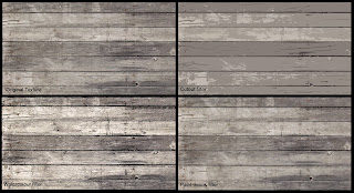
My starting point was a texture of wooden panels, similar to those that will be used in the project. I decided to look at four different styles, and below are the results. I think i need to consider what i am looking for when making a decision. I really like the cutout effect, but my question is that would it be too drastic of a stylistic choice to have the whole environment in this cutout style. I also really like the paint daubs style, because it allows a little realism to be kept, whilst still giving the texture a nice painted effect.


Saturation
The textures need to be desaturated, before being applied to the actual project. I experimented with looking at different levels of saturation. My favorite from those below is the second one in( top right), which is slightly desaturated from the original (bottom left). The whole piece is going to be slightly desaturated in colour to give the feel a more rustic feeling. I am contemplating the idea that it might be easier to keep all the textures to their original saturation, and then de-saturate the whole piece in post production.


Picture of texture applied in Maya.

Experimentation- Lighting Internal

I have moved on to testing the interior lighting. I will be doing this in the project, so i thought it was necessary to test in this project.

I started by creating a scene similar to what will be in the project. I wanted to look at replicating a ray of light shining through a window.
]

I first started with one single spot light, however the lighting was far too harsh and there was no shadow of the shape of the window being projected on the floor, which i was looking for.


This is a less harsh lighting render, i want the scene to look very dark and the image below is in some points what i am looking for.


I added a simple Sun and Sky system, and turned the lighting to black, so there was a more dense shadow inside the building. This way it gave me a nice projection of the window elongated on the floor.


The image below i mocked up quickly in photoshop, as to what i wanted the ray of light to look like.


After mocking up the image, i went back into Maya, and started to looking into fog systems, and i created a volume primitive, filled it with a white hazy fog and positioned it to where i wanted. This was the outcome.

I am extremely happy with the outcome. I took to researching volume primitives and it turned out well the fog is what i am looking for and i could see it working very well in the project. However one thing i would like to do in the future is look into more detailed fog, and have speckles of dust visible and floating around when the camera is amongst the fog in the scene.

I went on to looking at a project i created previously, and using it to study lighting.
I felt that doing this would give me a great learning base to try and create similar lighting to what i want to create in the upcoming 3rd year project.


I rendered the same scene out three different times, at three different points during the day;

Mid Noon


Dawn


Night


The three images above game me a lot of confidence that i did not previously have, that i could light a scene in three different ways. I am confident and will be taking this into the project.

Interior.and/or.Exterior lighting
I decided to look at ways of lighting wall lamps with fire and additional lights. I am certain i will need to do some sort of lighting similar to this.

I used particle effects to create a fast simple fire, and then wanted to create the lighting around the fire, to make it look as if it was radiating off of its surroundings.


Default lighting


Point light added with red/orange tint


Shadow added
I like this image below, it is my favourite so far, as it looks quite realistic in my opinion, however i will need to make the whole thing a little brighter as the scene will not be this dark in the project.


Scene lit up
I brightened the whole scene with an additional light, and it fixed my problem, below is the final outcome. I am very happy with this.


Below: a very simple mock up of a cube and inside it, a lighting test i did to try get the base light correct for the whole interior. I prefer the image above, because the corners of the room are still adrk, whilst the walls are a little lighter, and this is what i am looking for, i feel the corners of the rooms need to be a lot more dingy and dark.

Experimentation- Lighting External

Establishing Dawn
The first thing i did was to look at images of dawn. I posted up these 4 because they are the most appropriate uses of examples and i can explain what i mean by their visuals. The top left has a ver heavy orange hue, the bottom left has a very heavy pink hue and the two on the right are much more subtle in their colours. I have chosen to talk about them like this because i can now establish that i like the two on the right better. I like the very calm pink hue in the bottom right picture, however i like the sun in the top right picture a little more. I will be using these as reference imagery for what i try to create in Maya.


I first had to try to establish what dawn looked like. Using Maya sun and sky i adjusted the height of the sun, which in turn adjusted the setting of the sun.

Very low sun


Sun appears over building


Sun fully over building


The three images above were test renders of shots i produced after setting up a mock scene of an environment. I chose to use a simple city scape as an example because it provided a great range of depth in the environments for areas of light and areas of shadow. Out of the three images above my favourite is the second one, however the slight pink glow from the first one has a nicer feel to me for some reason. The position of the sun in the second is also good, however better in the third, as it is dawn and id rather the sun at this higher position and able to be seen. The second is my favorite because of the very subtle shadows and tones, and to me it looks the most like dawn.


Here are some screen shots of the render view and the normal view in Maya.


Applying it to something similar...
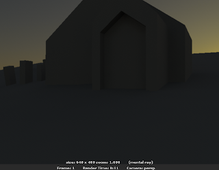
The next stage i felt was to try to apply what i learned to a scene similar to the outside of my scene i will be lighting for real. I created a simple shape resembling the building i will be lighting and had a go at lighting it.

Started off by applying sun and sky.
The look was too cool in colour palette, and didn't look much like dawn, so i decided to change the colours.


Tweaking the rotation of Sun And Sky, the sky had a more natural look to it as if it were a dawn sky. However i still had a problem with lack of pink hue in the sky, so i had to set about fixing this.


The image below is nice, it shows a good example of what dawn should look like in my opinion, however i would like to incorporate some sort of pink hue, as that is what is necessary for the project.


Adding a pink Hue


In the actual project, we need a very atmospheric sky, and speaking to my director, i was told that the sky needed to have a pink hue, so i went about trying to achieve this. There were a few ways i thought of doing it, i could tweak settings in Maya, or use a mask in post production to add a pink hue with after effects. These are the outcomes of the Maya tweaking.


Achieving a more natural look
With the sun and sky system in place i went about experimenting with other individual lights placed around the scene to reflect a nice warm pink glow off the building. I felt this was a problem in the previous renders as they looked a little unnatural, so i went about adding a new set of lights to give the impression of the lighting radiating off on to the building. Here are the outcomes.


Tweaking Gamma Controls
The gamma controls were the next things i set about tweaking, i felt the colours were much too saturated, and made the scene look a little fake, so i decided to desaturated them a little using gamma controls. From the images below i can say i prefer the top image.


Adjusting the size of the sun
The large sun is my favourite, i think it needs to be a little less obvious in the skyline, and maybe a bit more blended in to the sky, like in the reference imagery at the top of this post.

Small sun


Large Sun


Sky Dome Experiment
Another method i experimented with was sky domes. I started out by using a very simple sky dome i pulled off the internet, but when i tested it it didn't look very good, so i went on to experiment with colours and different ways of positioning the texture in the UV editor until i got a look i liked.

First attempt


Improved Sky-dome. More appropriate colour choice


I added a point light to create the illusion of sun lighting the front face of the building, however i think more lights are needed.


Added the second point light.


Simple lighting render of the sky dome and 2 point lights. Base lighting.


The outcome of my sky dome experiment is better than i thought it would be, however the colours were not what i wanted, i do think the general look and feel of the shot is better and it would look a lot more realistic than the sun and sky system method because it allows for clouds, and i can easily manipulate the positioning of the sky far more easily than i found i could do with sun and sky.